Adapting a responsive line chart recipe
Going back to the basics using BuildUI's chart template
There are many ways to code a chart using D3, each with their own tradeoffs, but all of them really cool! Here’s some of them:
- Amelia Wattenberger’s “How to learn D3.js” blog posts
- Matthias Stahl’s “Svelte + D3 training” videos
- UW and CMU’s Mosaic framework.
This post builds on Sam Selikoff’s responsive line chart recipe for Build UI. Its perks are mobile-friendliness AND being javascript-free all at once!
Read his writeup. It goes over all the details, but it turns out leveraging a couple SVG and CSS attributes can quickly assemble a chart that just works on any screen. And since it’s static, it can just be server-rendered and the browser will display it with little overhead. In theory, you could then enhance it with tooltips and all the magic you’d like, but the barebones chart will still work1. I tend to use SvelteKit so I forked his recipe for future use.
The project
Some time later, I started building a site called LuzPR that presents daily info on power outages in Puerto Rico. I decided to make it as straightforward as possible, so that the user only loads the page and immediately gets shown how many people have lost power. No interactions, brushing or anything that requires much buy-in; just reading2.
At first, that meant a simple table that showed a few summary statistics. However, now I was looking to add a plot to show a time-series of these power outages.
Sam’s recipe was perfect for this!
The source data changes infrequently, all users see the same graph, and it’s mostly just HTML and CSS on the page3. Here’s how it looks like:
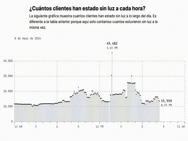
It’s a lollipop chart where each dot corresponds to the total number of people without power at each timestamp throughout the day. The x-axis ticks mark the time, and two annotations label the peak point and the latest point of available data.
Tricks from the original recipe
The most used trick is leveraging Tailwind’s container queries plugin to show or hide items according to the available screen width. For example, the x-axis includes more hour labels after a certain width, and it pushes the AM/PM label to a new line on small screens. Similarly, the label for the latest timestamp gets pushed to the top-right corner on small screens after the evening4.
<text
	class="inline @md:hidden"
	x={`100%`}
	y={`100%`}
>
	This one only shows up on screens smaller than medium-sized.
</text>

<text
	class="hidden @md:inline"
	x={`0%`}
	y={`100%`}
>
	This one shows up on screens that are at least medium-sized.
</text>
The biggest change from the recipe is how the dots are scaled. Instead of using a non-scaling-stroke, this chart uses a circle with a radius that scales with the width of the chart. This sort-of works because the dots are spaced evenly: every 5 minutes, or 288 daily observations.
<!-- 1 / 288 = .347222% -->
<!-- square root of 2 = 1.41 -->
<circle
	r='max(1px, calc(.347222% / 1.41))'
/>
Almost 300 dots is a lot for small screens so we set a minimum radius of 1px. SVG percentage units also work in strange ways so we divide by the square root of two to alleviate that5. Nevertheless, only CSS is needed to keep everything moving.
Some fun details
It turns out that the responsiveness built into the chart creates some welcome side effects!
The chart was designed as a lollipop chart which can be fully appreciated on large screens. However, when the screen size is reduced, the “sticks” of the lollipops blend together and give the illusion of a filled area chart. That’s two charts for the code of one!
The dots at the ends of the lollipops behave similarly. When the screen is compressed, the dots seem to form a line chart but with a few quirks. First, the “line” doesn’t always move continuously. Any sharp changes will appear to cut the line into pieces. This serves our use case well because our data is discrete at the end of the day. A long line connecting two dots (as a line chart draws) could falsely imply that many observations were rapidly changing value. Meanwhile, periods of relatively constant value will look like a normal line. Finally, outliers are still visible because they’re black dots against a white background. And when the dots get too small, they’re assisted by the sticks of the lollipop which act as arrows pointing towards the dots.
Conclusion
SVG is really flexible, and Sam’s recipe makes it so much simpler to use for charts. I appreciate the transparency and flexibility of using HTML and CSS for the basics. What you see is what you get, and you can sprinkle some Javascript magic when you need more.
If you’re interested in keeping up with whatever experiments I’m running these days, following me on Twitter is probably your best bet for now. Feel free to contact me over there!
Footnotes
-
Jake Archibald’s “Progressive enhancement is still important” is a great read. ↩
-
Maybe I read one-too-many HTMX essays about SPAs and excessively adding features before they’re needed. ↩
-
Since it’s a time-series plot it still uses some javascript to adjust the timezones. ↩
-
Checking the latest timestamp can be done server-side and based on that we include another Tailwind container query class. ↩
-
100% in SVG means the length of the diagonal of the element. WHY?? “Perplexing Percentages” from the “Using SVG with CSS3 and HTML5” book goes through the details. Square root of two (1.41 or 141%) is the diagonal length of an element with both width and height of 100%. I don’t think it’s a one-size-fits-all solution but it’s definitely close enough. ↩